
Choosing the Font:
Today we are going to discuss the font factor. This can seem like a trivial decision to make, but in reality the font will have a deciding impact on the magazine’s look and professionalism. Follow these simple rules to avoid annoying and losing your magazine’s audience.
To begin with, it’s essential you keep the number of different fonts used to a minimal. This means you only need to chose one or two fonts for your articles. Consider using one for titles and subtitles and the other for the body. Limiting the number of fonts will give more coherence to your magazine and help the reader navigate its contents. If you instead decide to use a wide variety of fonts there’s a good chance readers will be too tired and confused to finish your magazine.
Serif vs Sans
In typography, « serif » refers to the little extensions attached to letters in certain types of fonts. Check out the image underneath this paragraph for a clear visual explanation of what I’m talking about.

Studies have demonstrated that sans-serif fonts are easier to read on screen, whereas serif fonts have better readability once printed. For more information on the subject, check out this infographic.
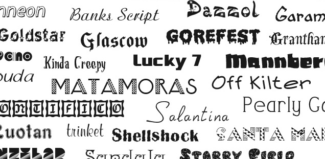
It’s better to stay away from weird « fantasy » and colorful fonts. Obviously creativity is extremely important, but communication should come before style. The best font disappears in the reader’s eyes to better convey the message. If you need inspiration, drop by MyFonts.com where countless fonts are organized under themes and keywords.
Good luck and share your creations with us on Twitter!